


Surf Palms is an ongoing collection of experimental paintings - each is an attempt to capture the ethos of surf culture, within the artwork, itself.
The checkerboard pattern - made especially recognizable by Vans - is a hallmark of that culture and history. To this day, the Vans checkerboard continues to be one of the most iconic everyday essentials, and a favorite amongst the subculture, with true “Off The Wall” style.


Timeless, but also representative of a specific time and place, checkerboard has always been one of my favorite patterns. It is, quite possibly, the boldest motif associated with surf and skate culture. After learning more about how checkerboard began to appear in the surf/skate community, I fell even more in love with it.
Inspired by the second wave of ska “two-tone” in the late 70’s, the checkerboard pattern offers a far more substantial meaning beyond the aesthetic of its design - it symbolized the breaking of racial barriers.


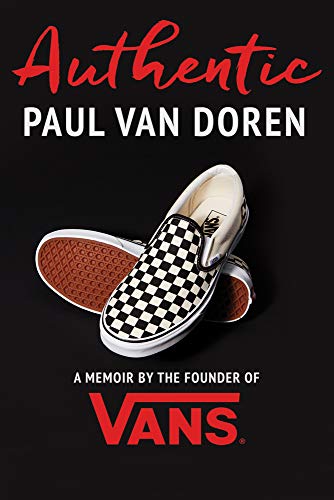
The story of the checkerboard begins in 1977 when Vans style #48 -- the Classic Slip-On -- was invented. Its low profile and slick design made it immensely popular with skateboarders in Santa Monica and Venice - Z Boys like Tony Alva and Stacy Peralta. In the late 70’s, Steve Van Doren, son of Vans founder Paul Van Doren, noticed that teenage skaters were coloring the rubber midsole of their shoe with black pens to create a checkerboard look. Steve, who began working for his dad at 11-years-old, further developed this idea - moving the pattern to the canvas upper to create the unmistakeable look.
. . . and just like that, the famous checkerboard design was born.


Beyond just a simple upper on shoes, checkerboard patterning has come to symbolize many things for many different people.
Around the same time that Van Doren was developing the checkerboard slip-on, the rise of the second wave of ska music – dubbed the ‘two-tone’ era of the genre – was also happening in Britain. The accompanying movement sought to transcend racial tensions in a politically volatile era, and bands championing it - like The Specials, The Beat and The Selecter - used a checkerboard pattern as a symbol of racial unity.
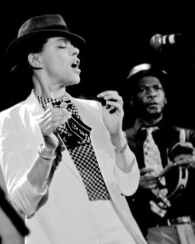
In the spirit of ska, and all that the Vans checkerboard represents, I painted this series to the soundtrack of one of my all-time favorite ska bands - The Selecter
The Selecter features a diverse line-up, both in terms of race and gender, and was "one of the key bands" of Two Tone music - mixing ska with the energy of punk rock. Lead singer Pauline Black, is a true force of nature. Her lyrics cover numerous social ills, including sexism and most prominently racism.
Not unlike Surf Palms - ska music is gritty, yet sunny and lightweight.
Enjoy!
sources:
https://www.vans.co.uk/news/history-of-the-vans-checkerboard-print.html
https://blog.urbanoutfitters.com/blog/history_of_the_vans_checkerboard


